Free Shiping on orders over $150 | Blended in Melbourne | TCM Grounded

Postpartum is a Chrysalis.

I love a good design and when I was building the Elan brand, I worked with an agency that really communicated my vision to bring the brand forward. Whilst the prospects of Elan have paused and pivoted whether it be due to the pandemic or taking some time to expand my family, our true essence of acknowledging and recognising traditional practices to support and empower families postpartum has not swayed.
Today I’m sharing a story of Elan’s branding and vision. Most times, followers, customers and the external audience don’t take note of the small details business owners make that create a well-considered and cohesive brand.
The name Elan was chosen to change the misconception many people have of Chinese Postpartum Confinement practices. Those unfamiliar with the concept will think of it as restrictive and a period of gloom. The word “Confinement” to describe the Chinese tradition of sitting the month “zuo yue zi”, is an inaccurate word to describe the sacred and special time. The term “Confinement” often conjures up images of darkness and a jail cell. Whilst the postpartum period ought to be a time of hibernation, a woman’s winter, it is a time to restore and recover and it has been observed by Chinese women for generations so that women emerge the other end in full bloom, just like a butterfly, after spending time in its cocoon, she emerges as a beautiful butterfly. We wanted the name to convey how we wanted mothers to feel having experienced beautiful nourishing care during a sacred time and we eventually landed on the French name Elan, which means lively and enthusiastic.
However, it is also the combination of two beautiful Chinese characters;
The Chinese characters I chose to represent Elan are “Yi” and “Lan”
Yi 意 the character for meaning, intention, wish, significance.
Lan 兰 a character in my mother's name, meaning orchid which represents love, luxury, beauty and strength.
The music was designed to convey a feeling of transformation that a mother goes through as she grows from maiden to mother. There is a sense of lightness and magic and wonder which is what we want the confinement period to invoke, not the darkness and restrictions that many associate with the word "confinement".
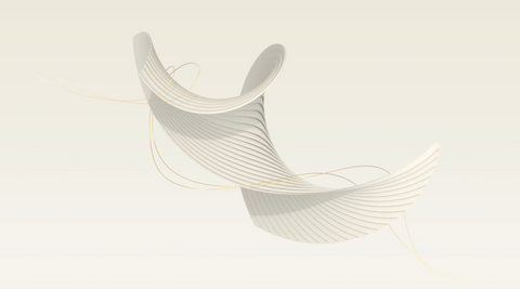
Our animation was created to symbolise the opening of a butterfly’s wings, ready to emerge into the world after being held, nourished and supported in her cocoon with her baby. The gold thread that appears in the middle of the animation is the chord that connects mother to child. This line also appears in our marque and the gold represents the preciousness of this bond and life.
The curves also represent the changing of the woman’s body as she becomes a mother. There is a softness to her. This animation has taken a bit of a back seat on our website but we use it in our packages that we send out to mothers.

Our font was custom designed to blend strength (boldness) and softness (curved edges).

Our packages are lovingly packed by one of the few beautiful women in my team.


I hope you have enjoyed learning more about how we developed the brand. Thank you for being a part of this journey!
With love and gratitude,
U-Fhern
See Instagram post here.
See Instagram post here.